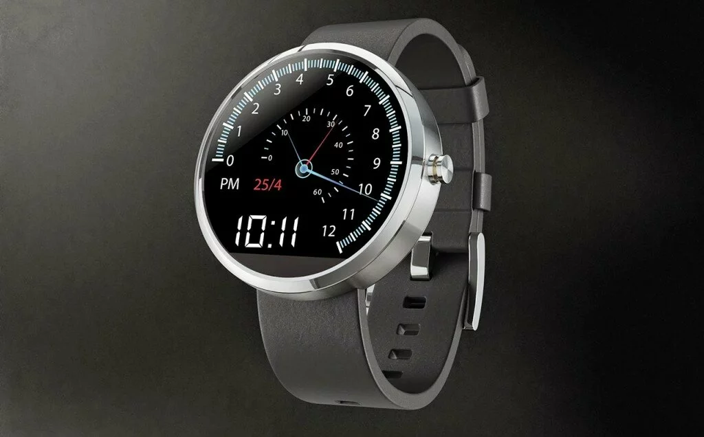
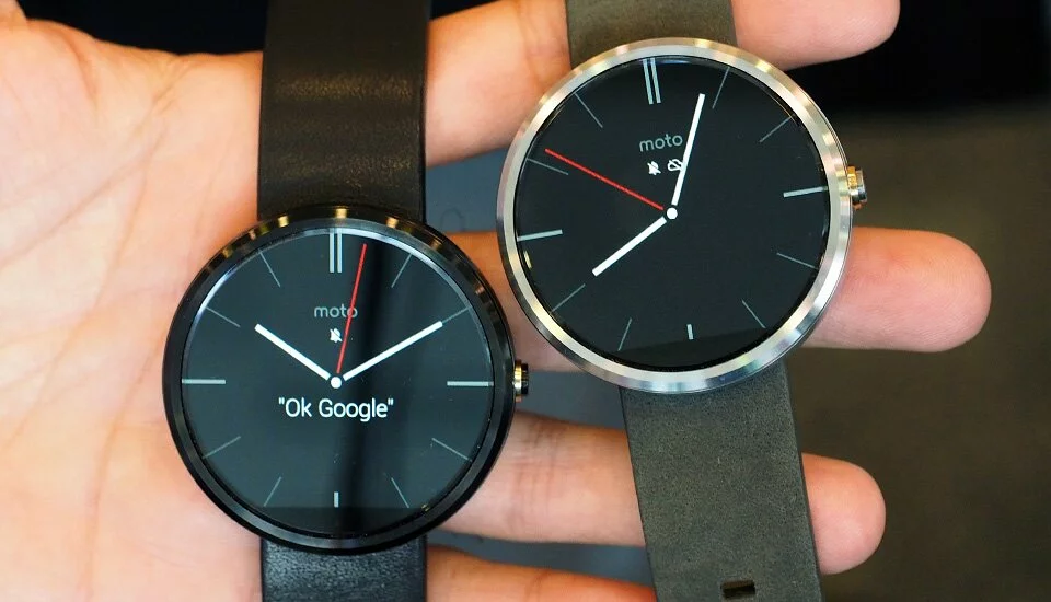
The Moto 360 is the first round Android smartwatch. Others will come, including the LG G Watch R, but this is the first you can buy. from www.flipkart.com.

The Moto 360 is distinctive. It has great watch faces, a good wrist strap and better microphones to understand your voice commands. But, at its os, this watch suffers the very same problems as other Android Wear watches: middling battery life, and apps that are difficult to access.
It’s not the Motorola’s fault. The real issue is Android , Google’s operating system for wearables. It’s just not a killer experience yet. The Moto 360 is just a prettier shell for Android Wear. It brings nothing new to your hand. And so, under the hood, it’s really not a better watch. Which is a shame, because with a better battery life, improved software, and a better understanding of fitness apps, this could be an interesting device.
Design
The Moto 360 is a cool-looking smartwatch. There’s no doubt about that.
Other round Android Wear smartwatches will be on the way eventually, including the LG G Watch R, but the Moto 360 is the first to arrive. And it’s not only fun to see a round display, but the watch construction is elegant, too.

On the side of the Moto 360, there’s a little home button. Unlike the Apple Watch’s fancy turning digital button, this is just a button. It activates the watch or puts it to sleep, or brings up a settings menu when you press and hold it.
On the back, the smooth surface has an optical green LED heart-rate monitor in the middle, while the rest of the back is inductive for contact-free charging.
The Moto 360 body feels thick compared to its strap, and its round display is slightly too large — larger than many people might like. But it has clean design and its lightweight.
At last ,
The Moto 360 is the best-looking Android watch, and one of the best-designed smartwatches. But looks don’t matter in wearables half as much as function. And at that, the Moto 360 is still mired in what the rest of Android Wear’s suffering through.


 Copyright © 2014 Geekybits. All rights reserved.